

About the Validation Select widget
A Spry Validation Select widget is a drop-down menu that displays valid or invalid states when the user makes a selection. For example, you can insert a Validation Select widget that contains a list of states, grouped into different sections and divided by horizontal lines. If the user accidentally selects one of the divider lines as opposed to one of the states, the Validation Select widget returns a message to the user stating that their selection is invalid.
The following example shows an expanded Validation Select widget, as well as the collapsed form of the widget in various states:
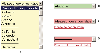
- A.
- Validation Select widget in focus
- B.
- Select widget, valid state
- C.
- Select widget, required state
- D.
- Select widget, invalid state
The Validation Select widget includes a number of states (for example, valid, invalid, required value, and so on). You can alter the properties of these states using the Property inspector, depending on the desired validation results. A Validation Select widget can validate at various points—for example, when the user clicks outside the widget, as the makes selections, or when the user tries to submit the form.
- Initial state
- The widget state when the page loads in the browser, or when the user resets the form.
- Focus state
- The widget state when the user clicks the widget.
- Valid state
- The widget state when the user has selected a valid item, and the form can be submitted.
- Invalid state
- The widget state when the user has selected an invalid item.
- Required state
- The widget state when the user has failed to select a valid item.
Whenever a Validation Select widget enters one of the above states through user interaction, the Spry framework logic applies a specific CSS class to the HTML container for the widget at run time. For example, if a user tries to submit a form, but has not selected an item from the menu, Spry applies a class to the widget so that it displays the error message, “Please select an item.” The rules that control the style and display states of error messages reside in the CSS file that accompanies the widget, SpryValidationSelect.css.
The default HTML for the Validation Select widget, usually inside of a form, comprises a container <span> tag that surrounds the <select> tag of the text area. The HTML for the Validation Select widget also includes script tags in the head of the document and after the widget’s HTML markup.
For a more comprehensive explanation of how the Validation Select widget works, including a full anatomy of the Validation Select widget’s code, see www.adobe.com/go/learn_dw_spryselect.